publicclassGUITest : MonoBehaviour { voidOnGUI () { if (GUI.Button (new Rect (25, 25, 100, 30), "Button")) { // This code is executed when the Button is clicked } } }
publicclassGUITest : MonoBehaviour { voidOnGUI () { if (GUI.RepeatButton (new Rect (25, 25, 100, 30), "RepeatButton")) { // This code is executed every frame that the RepeatButton remains clicked } } }
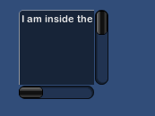
publicclassGUITest : MonoBehaviour { private Vector2 scrollViewVector = Vector2.zero; privatestring innerText = "I am inside the ScrollView"; voidOnGUI () { // Begin the ScrollView scrollViewVector = GUI.BeginScrollView (new Rect (25, 25, 100, 100), scrollViewVector, new Rect (0, 0, 400, 400)); // Put something inside the ScrollView innerText = GUI.TextArea (new Rect (0, 0, 400, 400), innerText); // End the ScrollView GUI.EndScrollView(); } }
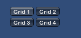
publicclassGUITest : MonoBehaviour { privateint selectedToolbar = 0; privatestring[] toolbarStrings = {"One", "Two"}; voidOnGUI () { // Determine which button is active, whether it was clicked this frame or not selectedToolbar = GUI.Toolbar (new Rect (50, 10, Screen.width - 100, 30), selectedToolbar, toolbarStrings); // If the user clicked a new Toolbar button this frame, we'll process their input if (GUI.changed) { Debug.Log("The toolbar was clicked"); if (0 == selectedToolbar) { Debug.Log("First button was clicked"); } else { Debug.Log("Second button was clicked"); } } } }
控件位置
Position是任何GUI控制函数的第一个参数。该参数是一个Rect类型。
可以通过获取屏幕宽度Screen.width和高度Screen.height来控制控件的相对位置。
1 2 3 4 5 6 7 8 9 10 11 12 13 14 15
using UnityEngine; using System.Collections;
publicclassGUITest : MonoBehaviour { voidOnGUI() { GUI.Box (new Rect (0,0,100,50), "Top-left"); GUI.Box (new Rect (Screen.width - 100,0,100,50), "Top-right"); GUI.Box (new Rect (0,Screen.height - 50,100,50), "Bottom-left"); GUI.Box (new Rect (Screen.width - 100,Screen.height - 50,100,50), "Bottom-right"); }
publicclassGUITest : MonoBehaviour { voidOnGUI () { // Make a label that uses the "box" GUIStyle. GUI.Label (new Rect (0,0,200,100), "Hi - I'm a label looking like a box", "box"); // Make a button that uses the "toggle" GUIStyle GUI.Button (new Rect (10,140,180,20), "This is a button", "toggle"); } }
声明公共变量的GUIStyle
声明公共变量的GUIStyle时,可以在Inspector中查看和配置GUIStyle。
1 2 3 4 5 6 7 8 9 10
using UnityEngine; using System.Collections;
publicclassGUITest : MonoBehaviour { public GUIStyle customButton; voidOnGUI () { // Make a button. We pass in the GUIStyle defined above as the style to use GUI.Button (new Rect (10,10,150,20), "I am a Custom Button", customButton); } }
动态更改GUIStyle属性
1 2 3 4 5 6 7 8 9 10 11 12 13 14 15 16 17
using UnityEngine; using System.Collections; public class Fontsize : MonoBehaviour { void OnGUI () { //Set the GUIStyle style to be label GUIStyle style = GUI.skin.GetStyle ("label"); //Set the style font size to increase and decrease over time style.fontSize = (int)(20.0f + 10.0f * Mathf.Sin (Time.time)); //Create a label and display with the current settings GUI.Label (new Rect (10, 10, 200, 80), "Hello World!"); } }
publicclassGUITest : MonoBehaviour { public GUISkin mySkin; voidOnGUI () { // Assign the skin to be the one currently used. GUI.skin = mySkin; // Make a button. This will get the default "button" style from the skin assigned to mySkin. GUI.Button (new Rect (10,10,150,20), "Skinned Button"); } }
布局模式
分为Fixed布局和Automatic布局。
在OnGUI()中可以同时使用两种布局模式。
界面的元素数量和位置确定的时候使用Fixed,反之使用Automatic模式。
使用Automatic模式的主要区别:
使用GUILayout代替GUI。
使用Automatic布局控件不需要Rect()函数。
1 2 3 4 5 6 7 8 9 10 11 12
using UnityEngine; using System.Collections;
publicclassGUITest : MonoBehaviour { voidOnGUI () { // Fixed Layout GUI.Button (new Rect (25,25,100,30), "I am a Fixed Layout Button"); // Automatic Layout GUILayout.Button ("I am an Automatic Layout Button"); } }
publicclassGUITest : MonoBehaviour { voidOnGUI () { // Make a group on the center of the screen GUI.BeginGroup (new Rect (Screen.width / 2 - 50, Screen.height / 2 - 50, 100, 100)); // All rectangles are now adjusted to the group. (0,0) is the topleft corner of the group. // We'll make a box so you can see where the group is on-screen. GUI.Box (new Rect (0,0,100,100), "Group is here"); GUI.Button (new Rect (10,40,80,30), "Click me"); // End the group we started above. This is very important to remember! GUI.EndGroup (); } }
publicclassGUITest : MonoBehaviour { // background image that is 256 x 32 public Texture2D bgImage; // foreground image that is 256 x 32 public Texture2D fgImage; // a float between 0.0 and 1.0 publicfloat playerEnergy = 1.0f; voidOnGUI () { // Create one Group to contain both images // Adjust the first 2 coordinates to place it somewhere else on-screen GUI.BeginGroup (new Rect (0,0,256,32)); // Draw the background image GUI.Box (new Rect (0,0,256,32), bgImage); // Create a second Group which will be clipped // We want to clip the image and not scale it, which is why we need the second Group GUI.BeginGroup (new Rect (0,0,playerEnergy * 256, 32)); // Draw the foreground image GUI.Box (new Rect (0,0,256,32), fgImage); // End both Groups GUI.EndGroup (); GUI.EndGroup (); } }
Automatic布局-Areas
是Automatic的默认模式。
默认是类似于Fixed的Groups布局。
以左上角为锚点。
区域内具有可见元素的控件宽度会拉整个区域的宽度。
使用GUILayout.BeginArea()和GUILayout.EndArea()来创建区域。
1 2 3 4 5 6 7 8 9 10 11
using UnityEngine; using System.Collections;
publicclassGUITest : MonoBehaviour { voidOnGUI () { GUILayout.Button ("I am not inside an Area"); GUILayout.BeginArea (new Rect (Screen.width/2, Screen.height/2, 300, 300)); GUILayout.Button ("I am completely inside an Area"); GUILayout.EndArea (); } }
publicclassGUITest : MonoBehaviour { privatefloat sliderValue = 1.0f; privatefloat maxSliderValue = 10.0f; voidOnGUI() { // Wrap everything in the designated GUI Area GUILayout.BeginArea (new Rect (0,0,200,60)); // Begin the singular Horizontal Group GUILayout.BeginHorizontal(); // Place a Button normally if (GUILayout.RepeatButton ("Increase max\nSlider Value")) { maxSliderValue += 3.0f * Time.deltaTime; } // Arrange two more Controls vertically beside the Button GUILayout.BeginVertical(); GUILayout.Box("Slider Value: " + Mathf.Round(sliderValue)); sliderValue = GUILayout.HorizontalSlider (sliderValue, 0.0f, maxSliderValue); // End the Groups and Area GUILayout.EndVertical(); GUILayout.EndHorizontal(); GUILayout.EndArea(); } }
GUILayoutOptions定义控件
可以使用GUILayoutOptions覆盖某些自动布局参数。
1 2 3 4 5 6 7 8 9 10 11
using UnityEngine; using System.Collections;
publicclassGUITest : MonoBehaviour { voidOnGUI () { GUILayout.BeginArea (new Rect (100, 50, Screen.width-200, Screen.height-100)); GUILayout.Button ("I am a regular Automatic Layout Button"); GUILayout.Button ("My width has been overridden", GUILayout.Width (95)); GUILayout.EndArea (); } }
扩展IMGUI
复合控件
在GUI中可能出现两种类型的控件同时出现的情况。就可以创建同时包含多种控件的复合控件。
例如:该控件同时包含Label和HorizontalSlider。
在此示例中,LabelSlider()会返回正确的值,以使其具有交互性。
1 2 3 4 5 6 7 8 9 10 11 12 13 14 15 16 17 18 19
using UnityEngine; using System.Collections;
publicclassGUITest : MonoBehaviour { privatefloat mySlider = 1.0f; voidOnGUI () { mySlider = LabelSlider (new Rect (10, 100, 100, 20), mySlider, 5.0f, "Label text here"); } floatLabelSlider (Rect screenRect, float sliderValue, float sliderMaxValue, string labelText) { GUI.Label (screenRect, labelText); // <- Push the Slider to the end of the Label screenRect.x += screenRect.width; sliderValue = GUI.HorizontalSlider (screenRect, sliderValue, 0.0f, sliderMaxValue); return sliderValue; } }
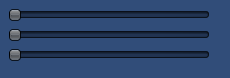
publicclassGUITest : MonoBehaviour { public Color myColor; voidOnGUI () { myColor = RGBSlider (new Rect (10,10,200,10), myColor); } Color RGBSlider (Rect screenRect, Color rgb) { rgb.r = GUI.HorizontalSlider (screenRect, rgb.r, 0.0f, 1.0f); // <- Move the next control down a bit to avoid overlapping screenRect.y += 20; rgb.g = GUI.HorizontalSlider (screenRect, rgb.g, 0.0f, 1.0f); // <- Move the next control down a bit to avoid overlapping screenRect.y += 20; rgb.b = GUI.HorizontalSlider (screenRect, rgb.b, 0.0f, 1.0f); return rgb; } }
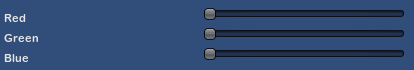
publicclassGUITest : MonoBehaviour { public Color myColor; voidOnGUI () { myColor = RGBSlider (new Rect (10,10,200,30), myColor); } Color RGBSlider (Rect screenRect, Color rgb) { rgb.r = CompoundControls.LabelSlider (screenRect, rgb.r, 1.0f, "Red"); // <- Move the next control down a bit to avoid overlapping screenRect.y += 20; rgb.g = CompoundControls.LabelSlider (screenRect, rgb.g, 1.0f, "Green"); // <- Move the next control down a bit to avoid overlapping screenRect.y += 20; rgb.b = CompoundControls.LabelSlider (screenRect, rgb.b, 1.0f, "Blue"); return rgb; } }